How do you pay tribute to something as beautiful and complex as a musical instrument?
Instrument Irony
I’m sure you’ve visited multiple museums in your lifetime and found yourself bored to death and a little perplexed as you stare at something locked away behind a glass screen. Why is it that in museums, the things exhibited are actually shielded?
Ironically a precious object is presented as an irrelevant item, impossible to engage with.
As part of my Architectural design project this semester, I was asked to design an exhibition stand for a unique musical instrument. I was given the Componium (Holland 1821), a huge, mechanical composing-machine which is incredible in its industrial nature. Revolutionary in its time, the instrument can be played by a single handle yet generate infinite compositions of music.
Currently the Componium sits within a dimly lit box inside the MIM Brussels. Sadly, an instrument designed to be infinite, is prevented from continuing to engage.
Oneindig
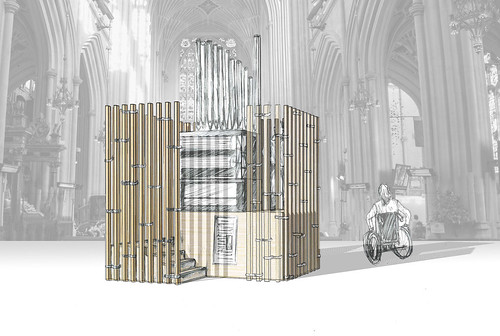
Thus, I proposed Oneindig: a timber platform scheme that allows 360 degree views of the Componium. The altar-like plinth deifies the instrument and timber cladding shields most of its nature, creating suspense on approach. Organ pipes project upwards out of this envelop. Visitors to the exhibition can embark on a journey around the exhibit, resulting in a very individual playing experience that allows them to fully engage with the instrument.
The timber cladding is inspired by the Lavender-Planted Hill Temple in Japan. Enveloping the altar defines an intimate and pure space whilst the shear height of the Componium escapes and pays tribute to the idea of infinity. Steel infinity shaped brackets tie the timber beams within the cladding together, reflecting themes of infinity and paying tribute to dutch vernacular traditions.
Does Preservation Have to Mean Imprisonment?
Whilst preservation cannot be neglected, it does happen to ‘freeze’ a subject in time. As a child, visiting museums was one of my favourite activities because I could interact with the information presented to me by use of buttons, costumes, puzzles… Yet now, I can’t bear to wander around a museum and read countless, static display boards that detail something I can’t quite see, because of lighting-glares on glass displays.
I think there’s a real need to reconsider how we protect a precious object and still allow for it to be exhibited. Is a glass box really the way to do it? Or can we use paths, lighting, narrowing spaces or other ideas to control crowds, reduce touch, and maintain without limiting interaction completely?


Leave a Reply